Redwoods Design by Alison Pickart
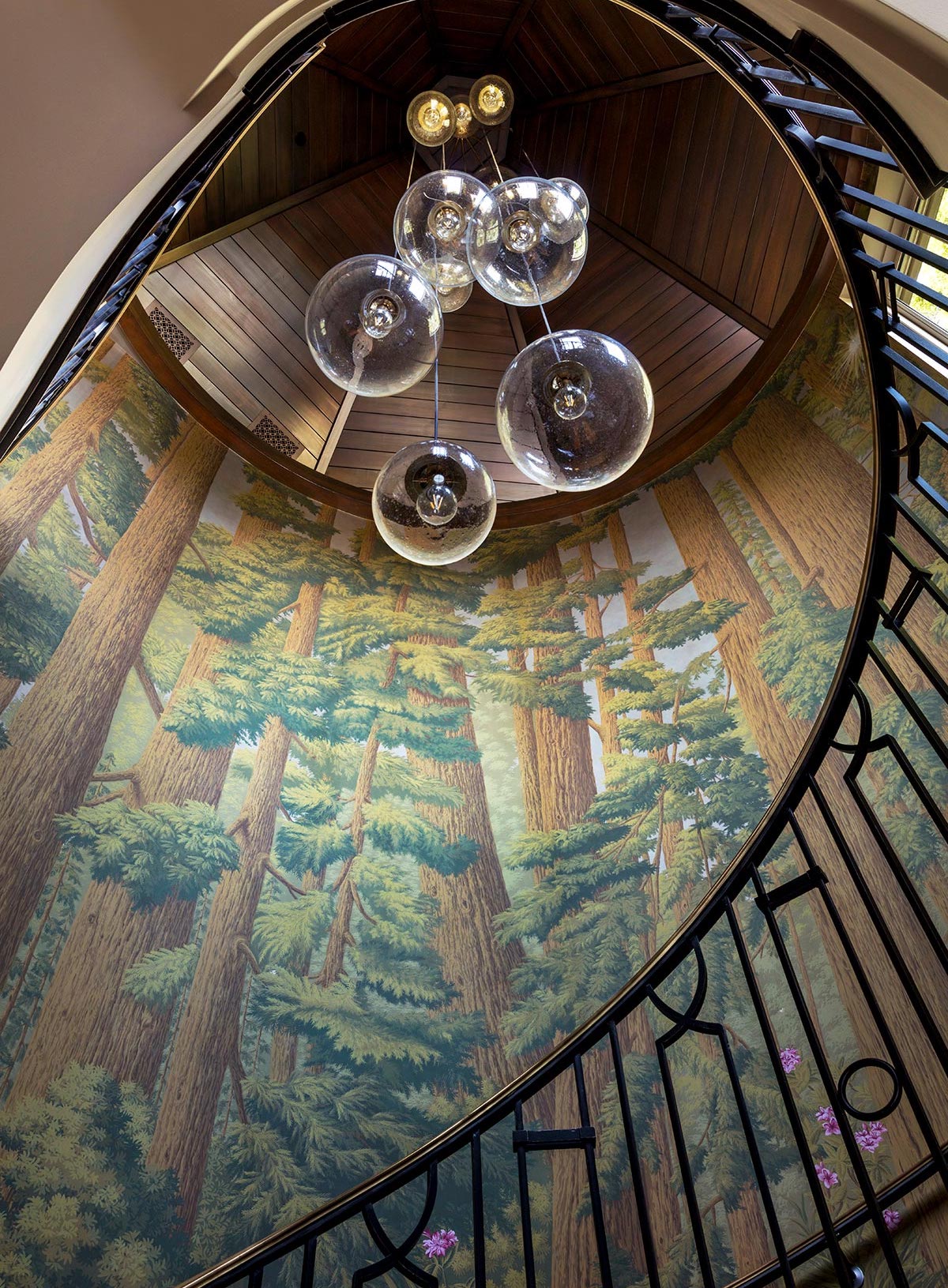
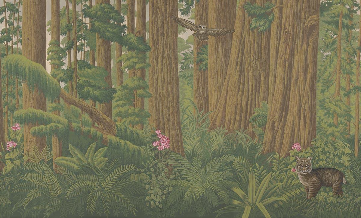
With the ‘Redwoods’ hand painted wallpaper, sought-after San Francisco-based interior designer Alison Pickart brings, for the first time, a West Coast Californian perspective to de Gournay’s Scenic Collection of wallpapers, originally inspired by the French 19th century tradition of block printing panoramic patterns. Here, Alison’s interpretation of the depths of a magnificent, majestic Northern Californian redwood forest, complete with woodland creatures, including racoons, foxes, bobcats, squirrels and red-tailed hawks, brings this unique natural scene magically to life.
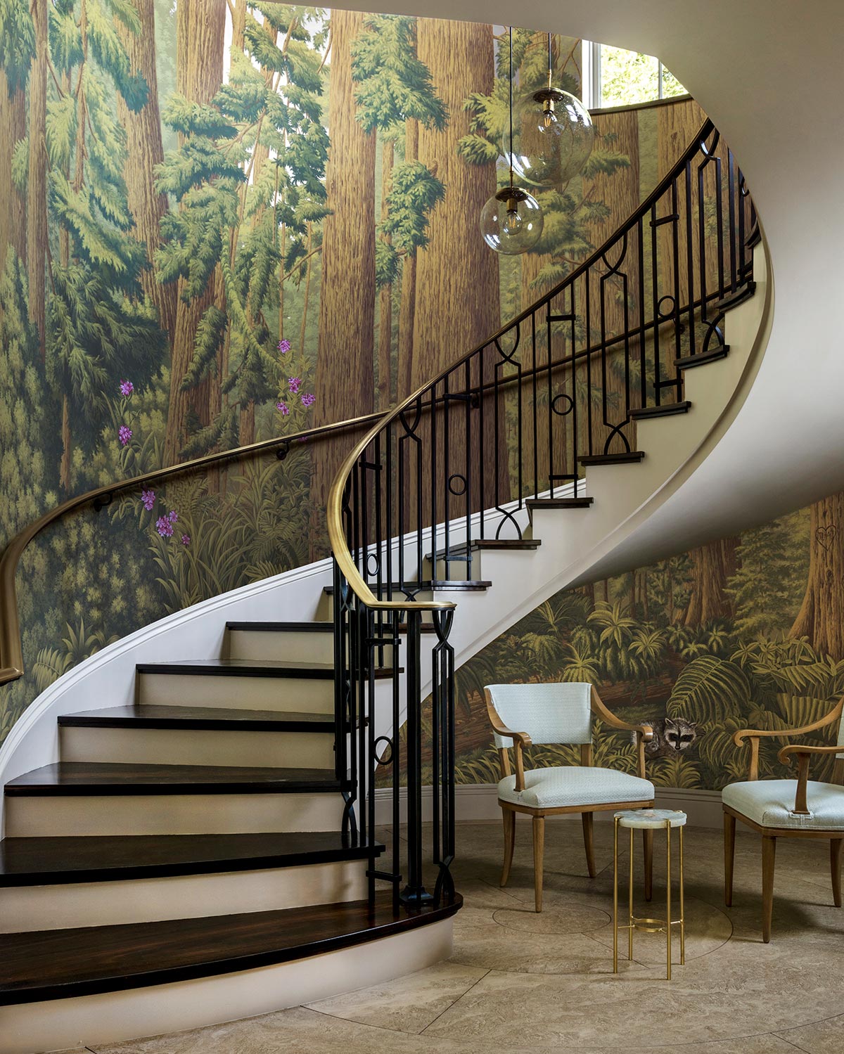
Inspiration for the design struck when Alison was commissioned to create a forever home for clients based in San Francisco, for whom she had also previously worked on homes in London and Chicago. Having travelled and lived all over the world for business, her clients’ design brief was to reflect the house’s surroundings to ground it in its locale. With the property surrounded by three different groves of towering redwood trees, one of which can be seen through the 28-foot-tall stairwell’s first floor windows, Alison’s design drew on the landscape of these magnificent, majestic trees to help blur the boundaries between outside and in.
As the staircase traces from the bottom step the design evolves from the dense forest floor, filled with thick, furrowed tree trunks and dotted with native lilies, sword ferns and bushes of chinquapin and laurel, higher and higher up into the forest’s lighter, airier treetops, where the sunshine attempts to stream through the lofty canopy. The design is set against a hand gilded metallic backdrop that has lent a hazy sense of dawn or dusk to the wallpaper, its mood constantly changing throughout the day as natural light from outside streams through the stairwell’s windows and dances across the redwoods’ leafy coniferous branches. The ultimate blurring of boundaries, between reality and imagination, “steals your breath away,” says Alison.
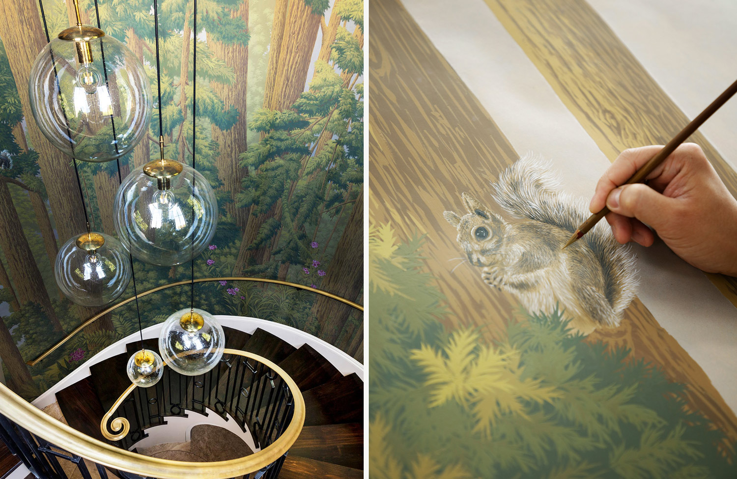
‘Through’ spaces like this stairwell provide “great opportunities for doing something really strong,” says Jemma Cave, de Gournay’s Design Director. “As you don’t have to be with it all day long, you can do something more fun in this kind of space – here, as you pass through, you can notice the change of light at different times of day and the feeling is very much like being deep within nature.”
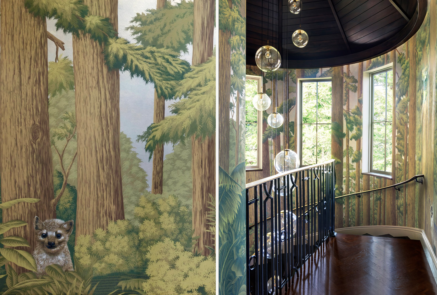
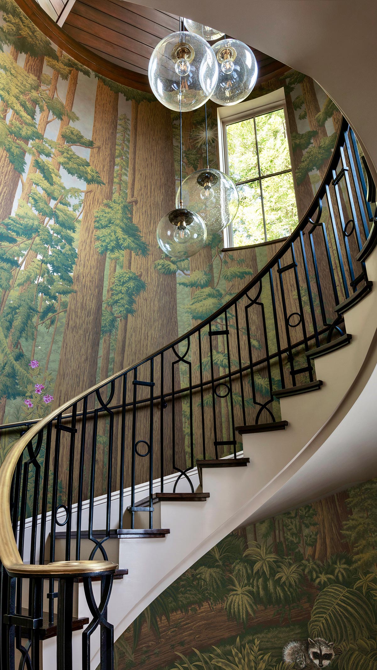
Having stripped back the original house to its bare bones, originally built in the 1980s, Alison reconfigured the floor plan inside to include a new circular staircase positioned off the entrance hallway, its purpose to link the ground and first floors. “I wanted to create something beautiful, smooth, wonderful and breathtaking,” says Alison of the wood paneling and vaulted circular decorative beamed ceiling. Alison knew the staircase was going to add a “special moment” to the design of the house – within its self-contained space, slightly isolated from the rest of the house, it proved the perfect opportunity to do something more “organic and freeform,” she recalls. “It remained a blank white wall for about a year and a half because we knew we couldn’t just throw anything up onto it. We had to really take our time with it,” says Alison.
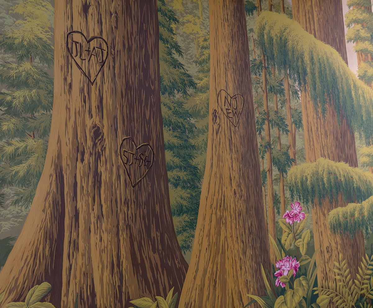
With de Gournay’s ability to customise each design to suit specific spaces, Alison had fun including the clients’ initials (and the initials of their children), captured within love hearts and painted to look as if carved into the tree trunks. The clients’ favourite native animals and birds were researched and intricately drawn; and for fun, if you look very closely, you will spot the very rare humboldt marten hiding in the undergrowth.
“I love the way this reflects the history of my clients – they met early in their lives and they’ve built a life, with three children, together,” says Alison. “I wanted to add a little heart to mark it as their forest – the design was an artistic nod to who they were and who they are now, making it really personal to that family.” “It’s always challenging to design and paint panels across such a large scale,” says Jemma about these 7m tall panels. The design for the panels was developed inhouse from Alison’s initial sketches and then painted by their specialist panoramic artists. “We have only ten artists in our panoramic studio – they’re the most highly regarded in our team, seen as the masters due to the level of detail and precision required to paint this type of design.”
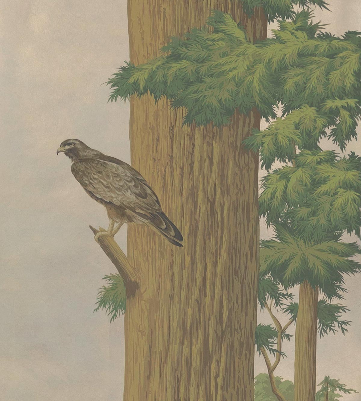
The backgrounds are created by hand laying individual squares of metal leaf over a smooth paper base, each gold leaf measuring 4” square). Then it is sprayed – “for this particular project, to create the misty sense of dawn, so it was sprayed with silvery pigment first, and then warmer layers over the top, to alter the tone of the metal leaf,” Jemma explains – and then the design is drawn out by hand before being infilled firstly with broad, and then finer, brush strokes to gradually build up the detail.
lison’s design ethos is simple: “I want to create interiors that reflect who my clients are – I want them to feel the great amount of thought I’ve put into each space, reflected in the layering of considered detail and superior materials. I design interiors built to last.” The owners, having now lived with the design for more than a year (installed October 2019) assert they are still stunned by it. “Every time I go up or down the stairs, it’s literally like watching an ever-changing landscape, there’s something new to notice every single day,” says the wife. “Knowing that this is how they travel down to their day every morning they are in that house, knowing that it’s really something to behold – something that says to them ‘go out and get them today’ – is really inspiring,” furthers Alison.
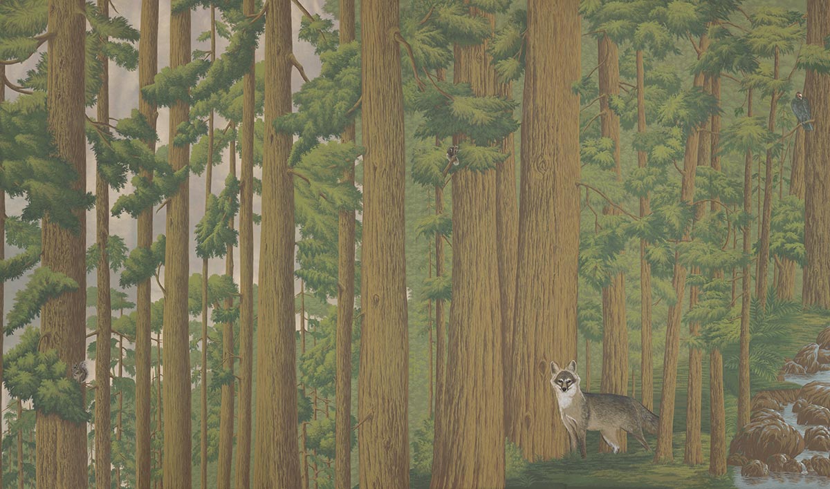
The addition of ‘Redwoods’ to de Gournay’s Scenic collection also marks a departure from the traditional 19th century aesthetic of block-printed-style panoramic wallpapers. “Historically, a panoramic design would include a sense of vista and a horizon line – yet for ‘Redwoods’, you don’t actually get this because the towering trees are so dense and you are placed in amongst them,” explains Jemma. “There is an impression of the leaves and trunks getting smaller in the distance, to provide a sense of depth, but it was important that the wallpaper makes you feel like you’re really standing in the middle of an epic Redwood forest.”
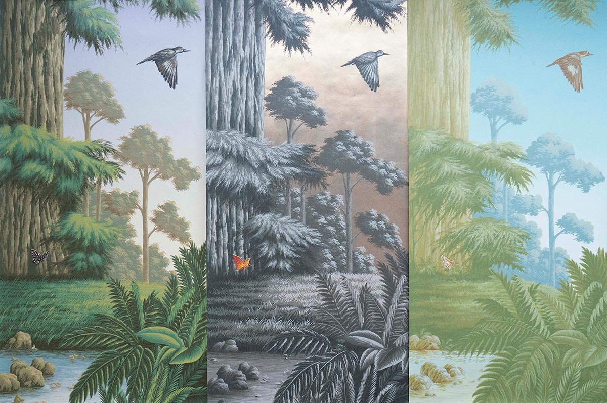
As panoramic wallpapers have traditionally depicted historical scenes, this depiction of an awe-inspiring redwood forest at such a grand scale feels “versatile and modern,” furthers Jemma. With Alison, de Gournay have created four colourways for the hand painted wallpaper each available on any of de Gournay’s signature backgrounds (with further bespoke options available). “Adding a California scenic into the de Gournay collection is exciting – in terms of geography and natural beauty, from the forests and deserts to the coastline, there is so much potential for future collaborations,” says Alison.
To enquire about samples or pricing please email info@degournay.com.
Written by Fiona McCarthy

